


How to master color contrast for accessibility (WCAG made easy)
Simple rules to ensure your designs are clear, readable, and inclusive.


Heyho! If you enjoyed this post, you can also read it for free on Medium, X.com, and other platforms where I share weekly design gems and workflow boosts.
👉 Don’t forget to clap if you found this helpful — it really supports my work and keeps the good stuff coming!
Did you know that around 2.2 billion people worldwide experience visual impairments? From legally blind individuals to those who simply don’t have perfect 20/20 vision, designing for accessibility isn’t just thoughtful — it’s essential. Ensuring that your text has proper contrast is one of the easiest and most impactful ways to improve accessibility.
Let’s break down what you need to know about WCAG 2.0 color contrast guidelines and how you can quickly apply them to your designs.
Understanding WCAG contrast scores
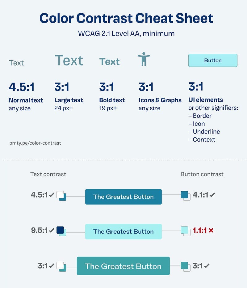
The Web Content Accessibility Guidelines (WCAG) define four main scores for color contrast:
Fail: Contrast ratio below 2.9
AA Large: At least a 3.0 ratio (use only for larger text)
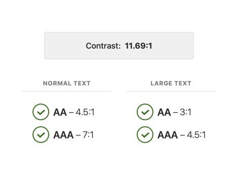
AA: At least a 4.5 ratio (safe for standard use)
AAA: At least a 7.0 ratio (best for long texts)
Fail (Contrast < 2.9)
Avoid using this score for readable text. A failing contrast might look stylish at first glance, but in real-world conditions — like bright sunlight or a dim room — it’s difficult to read. You can, however, use this for decorative items, logos, borders, and inactive buttons.
Example: White text on a very light grey background (contrast 1.5).
AA Large (Contrast 3.0)
This level is suitable only for larger texts (18px bold or 21px regular and larger). It’s also great for primary calls-to-action (CTAs) and interface icons.
Example: Medium-grey (#949494) text on white (#FFFFFF) background.
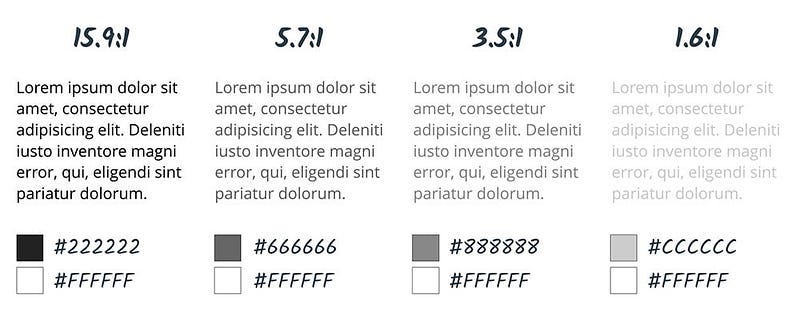
AA (Contrast 4.5)
AA contrast meets the needs of most users. It’s safe for general text use across your design. Empirical studies associate this level with users having roughly 20/40 visual acuity.
Example: Dark grey (#777777) text on white (#FFFFFF).
AAA (Contrast 7.0)
AAA is enhanced contrast recommended especially for lengthy reading. It’s particularly beneficial for users with significant visual impairments (approximately 20/80 vision).
Example: Pure white (#FFFFFF) text on dark grey (#595959).
Special considerations for mobile
Mobile screens are frequently used outdoors or in varying lighting conditions, making contrast even more critical. Always lean toward higher contrast levels on mobile apps to ensure text remains readable in direct sunlight, bright rooms, or darker settings.
How are these ratios calculated?
(L1 + 0.05) / (L2 + 0.05), where
L1 is the relative luminance of the lighter of the colors, and
L2 is the relative luminance of the darker of the colors.
What I recommend:
Always check your color combinations with native Figma color contrast checker or any other external tools like Silktide for example
Prioritize AAA contrast for long-form text, documentation, blogs, and educational content.
Use AA or AA Large for interface elements and shorter text snippets.
Why to strive for AAA?
Achieving full AAA accessibility isn’t just about color. It also involves:
Allowing users to select their own foreground and background colors.
Keeping line lengths under 80 characters.
Avoiding justified text alignment.
Ensuring adequate line spacing (at least 1.5 times within paragraphs).
Allowing text resizing up to 200% without horizontal scrolling.
and remember:
Accessibility isn’t just good ethics; it’s excellent design. By following these guidelines, you ensure your digital products are truly inclusive.
Give it a try, your users will thank you!
Happy designing!